AI UX · Enterprise healthcare · UX/UI engineering

CDI Assist

Simplifying a complex clinical documentation workflow — then translating AI UX research into concrete, testable interaction patterns for evidence, trust, recovery and attention.

CDI Assist DRG and Rules interface from the interactive handoff prototype
My role

Research → UX strategy → UI → working prototype

I owned the design exploration, prototyping and front-end handoff, with a focus on reducing information overload and making AI-supported workflows understandable and controllable.

Try the interactive prototype ↓
RoleUX/UI Engineer
Duration1 month
UsersCDI team
ScopeResearch · UX · UI · Prototype · Handoff
01 · Problem

Too much information was competing for attention.

The CDI workflow contained a large amount of useful clinical and coding information, but usefulness did not automatically translate into usability. The design challenge was to help CDI specialists reach the information they need for the task at hand without making them process everything on the screen at once.

Show users what they need, when they need it — not everything that is available.
01

Reduce cognitive load

Prioritize the most relevant clinical and coding context instead of giving all information equal visual weight.

02

Reduce context switching

Keep evidence, patient context and documentation close to the task rather than forcing users to move between disconnected views.

03

Make actions obvious

Clarify what users can review, add, dismiss, verify or continue manually.

02 · Research

Designing for appropriate trust — not simply making AI look trustworthy.

The AI UX research focused on AI-generated recommendations, summaries, insights, drafts and actions inside existing healthcare workflows. The core idea was that users should have enough transparency, evidence and control to decide whether an AI result deserves their trust.

Research takeaway Good AI UX gives users enough information and control to determine when an AI result deserves their trust.

Five questions every consequential AI result should answer

WHAT?What is the AI telling me?
WHY?What evidence supports it?
LIMITS?What does it not know?
CONTROL?What can I do with it?
SOURCE?Can I verify it?

Research translated into product requirements

01
Human control

AI supports judgment rather than silently replacing it. Review and confirmation should increase with consequence.

02
Evidence & verification

Consequential recommendations should expose patient-specific evidence and make source verification easy.

03
Transparency & provenance

AI-generated content should remain distinguishable from verified source-of-truth data.

04
Uncertainty & freshness

Missing, conflicting, incomplete or stale information should be visible rather than hidden behind false precision.

05
Correction & recovery

Users need meaningful ways to modify, reject, retry, cancel, undo or continue manually.

06
Workflow fit

AI should appear where it supports the task — not become another disconnected alert stream.

Recommended interaction model
OUTPUTEVIDENCEDECISIONACTION

Lead with the useful result, expose supporting evidence and limitations, let the user decide, then perform downstream actions with appropriate review or confirmation.

03 · Design strategy

Keeping the workflow visible without making the interface feel overloaded.

I explored multiple ways to structure the experience and compared the trade-offs between seeing the whole workflow, separating dedicated work areas and focusing on one step at a time. The handoff direction uses clear top-level navigation and task-specific views so the user retains context while the screen remains focused.
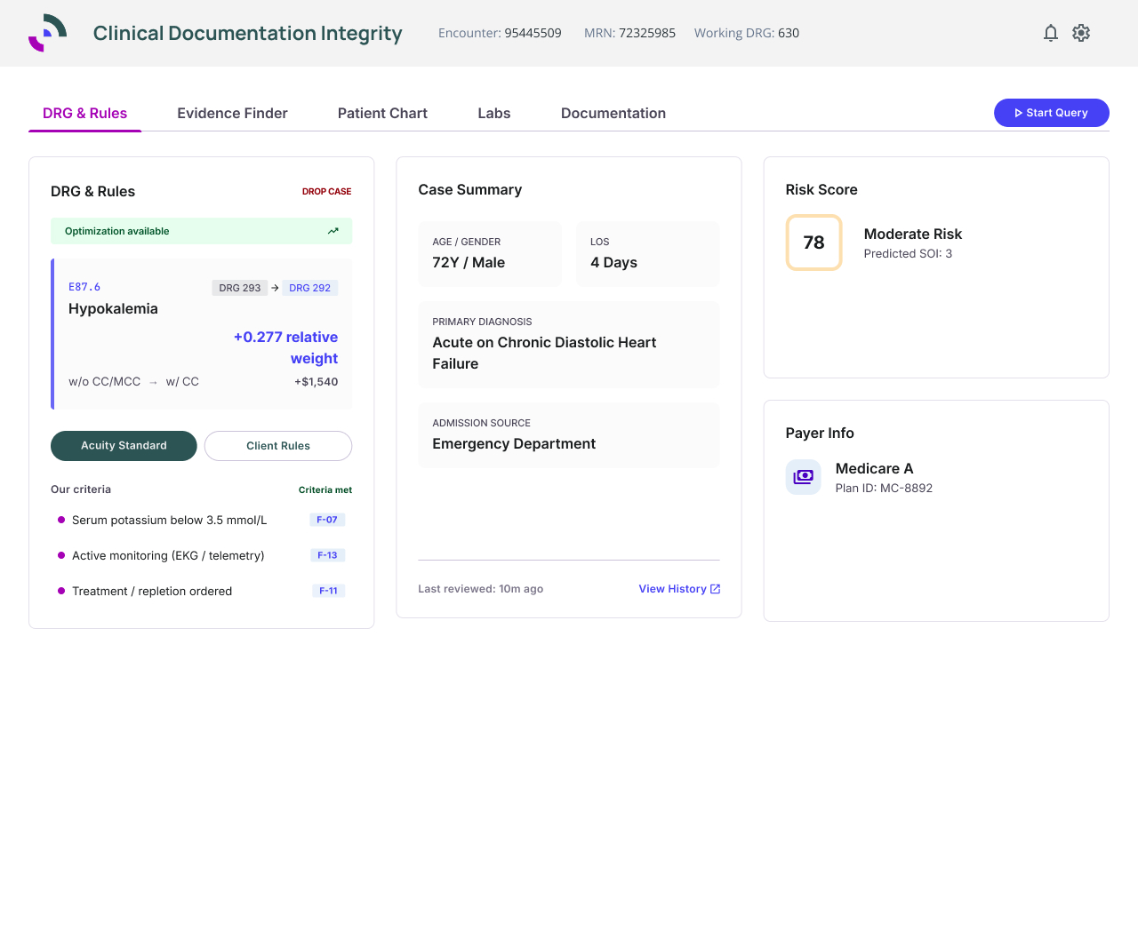
CDI Assist handoff prototype showing DRG and Rules
DRG & RulesRelevant DRG context, case summary, risk and payer information are grouped into distinct decision-support areas.
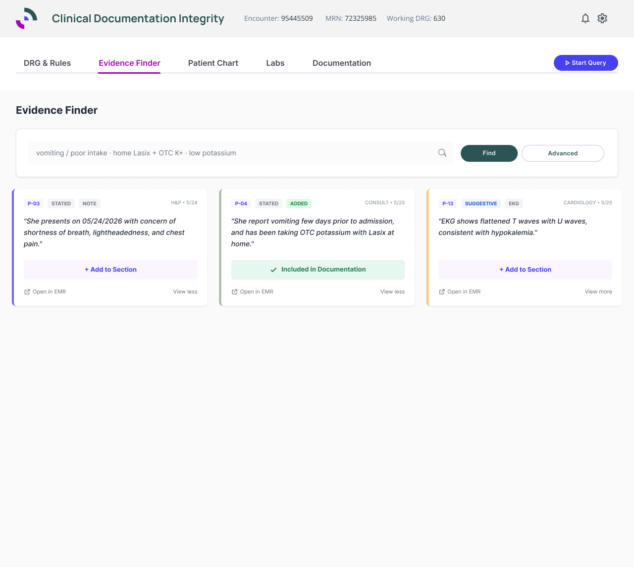
CDI Assist handoff prototype showing Evidence Finder
Evidence FinderA focused search-and-review experience allows users to evaluate evidence, verify source context and add findings into documentation.
04 · AI UX proposals

Turning research findings into testable UI behavior.

I selected two research findings for deeper exploration: explicit AI failure and recovery states, and prevention of alert fatigue. These were intentionally framed as UX proposals for discussion and validation — not as final engineering requirements.

#15
Failure & recovery

Different problems need different explanations.

A generic “Something went wrong” state does not tell a user whether AI lacked evidence, found conflicting information, is stale or is technically unavailable.

Insufficient dataExplain that supporting information is not enough.Review evidence / Continue manually
Conflicting evidenceSurface differing source information rather than silently resolving it.Review conflicting evidence
Stale analysisTell the user when new patient information exists after the AI result.Update analysis
AI unavailableKeep the normal workflow available even when AI cannot complete analysis.Try again / Continue manually
#18
Attention hierarchy

Not every AI insight should become an alert.

If every finding receives the same prominence, important recommendations compete with lower-value noise. The proposal introduces contextual hierarchy and groups related findings.

InformationalContextual / passive
Needs reviewVisible in workflow
ImportantElevated priority / queue
CriticalInterruptive only when appropriate
05 · Interactive developer handoff

Don’t just view the design. Try it.

Click DRG & Rules, Evidence Finder, Patient Chart, Labs and Documentation inside the prototype. The interactive version demonstrates navigation, workflow states and the AI UX proposals in context.

Open full prototype ↗
Interactive prototype · click inside

Prototype behavior is intentionally interactive. In Evidence Finder, the prototype scenarios demonstrate normal, insufficient-data, conflicting-evidence, stale-analysis and AI-unavailable states. In DRG & Rules, the AI review queue demonstrates prioritization and grouping.

06 · Validation & impact

From UI proposal to questions the team could validate.

The prototype was designed to support product discussion and user validation. Rather than assuming the patterns were correct, the next step was to observe whether users could distinguish failure types, understand the next action, recover without unnecessary retries, and identify what deserved attention.

Workflow clarityStreamlined the workflow by prioritizing relevant information and reducing unnecessary navigation.
ConsistencyImproved consistency with clearer, reusable patterns across task areas.
FeedbackReceived positive feedback from users and stakeholders on the workflow direction.
HandoffDelivered a working HTML/CSS/JS prototype so interaction intent was visible to engineering.
Reflection

In AI-enabled enterprise products, the goal is not to make the interface feel more “AI.” It is to make complex decisions easier to understand, verify and control.